Showing posts with label 2. Show all posts
Showing posts with label 2. Show all posts
Thursday, February 12, 2015
Need for Speed Underground 2 for PC full version with system requirements

In addition to the racing modes included in the previous Underground game (Circuit, Sprint, Drag and Drift races), four new variations of races have been provided in Underground 2. One racing mode was dropped, this being the Knockout competitions. Still, a Lap Knockout option is available when racing Circuit in non-career races. Underground 2 is unique among the games in the Need For Speed series in that it requires players to drive to a certain place in the city in order to begin a race (other games allow the player to select a race from a menu). Most races are marked on the in-game radar, but some are hidden and the player must search for them, should he decide to play them.
A circuit race is a standard race that involves up to four cars driving around a track that loops back to the start line of itself. A circuit race is typically a maximum of four laps and minimum of 2 laps. A sprint race is just like a circuit race except that the track does not loop back to the start line. Its a race from A to B involving a maximum of four vehicles, and because of the track design there is only one lap. Street X races are similar to Circuit races, but they take place on closed courses similar to Drift races.
Drifting is one of the easier types of racing (depending on difficulty level) in Need for Speed Underground 2. One difference to the drifting mode compared to the original Need for Speed Underground is that the player drifts with the other competitors at the same time. Players race against a maximum of three competitors. Points are awarded when the player successfully slide the car and finishes the drift without hitting any walls. Like the Street X mode, no nitrous oxide is allowed. There are also some special downhill drift races where the player starts at the top of a hill and has to slide down from top to bottom, a drifting equivalent of a sprint race (from point A to point B). In these races, there are no other racers, however there is normal city traffic. Players increase their points by sliding past city cars. Drag racing is a point-to-point race that forces players to use a manual transmission. Steering in this mode is simplified to simply allow for lane changes, while the game handles the steering along the lanes, and the player focuses more on maintaining an optimum speed for the car. The Nitrous Oxide meter is enlarged and displayed on the left side of the screen.
The Underground Racing League (URL) is a set of tournaments which takes place in a specific set of closed tracks outside city streets - either actual racing circuits or airport runways. URL tournaments typically consist of one to three races, with the player racing against five opponents. In tournaments with two or more races, a points system is used. At the end of each race, drivers receive a specific amount of points according to their standing in a race. The total score at the end of these races determines the winner of the tournament.
While cruising around the city, players can challenge other cruising opponents in a one-on-one race(these are called "Outrun Races"). The leader is given the freedom to pick his/her racing route, and must attempt to outrun the opponent and distance itself from him/her to as much as 300 metres (980 feet) to win. This racing formula is similar to that of Tokyo Xtreme Racer and Wangan Midnight video games, which uses health bars instead of distance to determine the winner. Once a certain amount of victories have been won by player in certain levels, the player is awarded a unique part free of charge by another racer. These parts are necessary to achieve 100% completion of the game. Read more
System requirements:
MINIMUM PC REQUIREMENTS
Windows 98/ME/2000/XP
933MHz Processor
256MB RAM
8X CD-ROM Drive
2GB Hard Disk Space
32MB DirectX compatible ATi Radeon 7500 or nVidia GeForce2 Class Video Card
DirectX compatible Sound Card
DirectX compatible Controller or Keyboard
DirectX 9.0c
MULTIPLAYER SYSTEM REQUIREMENTS
Broadband Internet Connection
Screen Shots; Click on the image to view large
 |  |  |
How to Download

File Size: 232 MB
Need for Speed: Under ground 2 for PC: Download
I hope you like it....!

Wednesday, February 11, 2015
Midtown Madness 2 for PC full version with system requirements

There are few sure things in life, but one of them is that if Microsoft puts out a racing game with "Madness" in the title, you might as well grab it as soon as it hits store shelves. Midtown Madness 2 is no exception to this rule. It doesnt matter whether youre a hard-core simulation fan or you simply crave speed, destruction, and mayhem in your games - if you want to play a very fun racing game, then Midtown Madness 2 is for you.
But thats not to say that Midtown Madness 2 is ideal. In fact, it seems as though it could have used a couple more weeks in testing. On several occasions the game completely locked up on a fairly standard system (Celeron 450MHz, 256MB RAM, TNT2 video card with the latest drivers), and only through uninstalling and reinstalling did the problem finally seem to go away. As in some other racing games, the brakes dont truly function as real-life brakes when both pedals are configured to use the y-axis: Slamming on the pedal doesnt lock the wheels but merely decelerates your car more quickly. An attempt to correct this by configuring the pedals to use two axes revealed a bug - the brakes worked in reverse, forcing you to keep the pedal down for no brakes and releasing it to stop. Your only true braking option is the hand brake, which tends to cause unpredictable slides when all you really want to do is slow down in a hurry. Also, at the beginning of one race, my car was positioned facing in the opposite direction of the other cars, and stepping on the gas sent me hurtling backward along with them even though I was in first gear. Fortunately, none of these problems were persistent or detrimental to how enjoyable the game turns out to be.
You can actually work your way around most of these issues, and in fact you might never experience a game crash yourself. But theres no getting past the games rather pathetic engine noises. When you see a 68 Mustang Fastback tearing through downtown San Francisco, you want to hear a mighty rumbling sound thatll make bystanders think the big earthquakes finally happening. Instead, the cars in Midtown Madness 2 give off a little purr that barely changes in tone even when youre redlining the tachometer. Even in an arcade-style racing game such as this, its good to be able to hear when you should change gears, rather than constantly have to check the tachometer.
The occasional bugs and the weak sound effects are the only low points in Midtown Madness 2, because otherwise, the game is a blast. Midtown Madness players whove grown used to screaming through Chicago will be happy to find two new venues featured in the sequel: San Francisco and London. As in the original game, both cities have been meticulously modeled to include many notable landscapes. In San Fran, youll see Coit Tower, the Palace of Fine Arts, and of course the Golden Gate Bridge; in London, you can tool around Trafalgar Square and even ram through the gates of Buckingham Palace and do a few donuts on the well-manicured lawn. Read more
System requirements:
CPU Type: Pentium II
CPU Speed in MHz: 266MHz
RAM: 32MB, 64MB (Windows 2000)
Hard Drive Space: 250MB
Sound Card: DrectSound Compatible
CD Drive Speed: 4X
Graphics Type: SVGA
Graphics Resolution(s): 800x600
Compatible Devices:
Software (DirectX 5.0, etc.): DirectX 7.0a
Screen Shots: Click on the image to view large
 |  |  |
How to Download
File Size: 157.3 MB
Midtown madness 2: Download
Midtown madness 2: Download
Password: 4hthebest.blogspot.com
Bloody Roar 2 for PC full version with system requirements

Bloody Roar II is a 3D versus fighter where 1 or 2 players can play as a variety of fighters who can transform into larger Beast forms. Each fighter is a Zoanthrope, a human who can transform into a large animal-human hybrid, a combination of the character and their token animal. This second form grants additional power to a player for as long as that power can be sustained. Rock solid graphics and fierce involved fighting are hallmarks of the Bloody Roar series. Some new features in the game since the previous one are: new story modes, 7 new characters, addition to the beast drive, more than 90 drawings in the game, and new cheats, including small head and big head.
Like Bloody Roar, the game was acclaimed for stunning graphics and special effects on the PSone. Both characters could transform and revert from a second form with no loading. Arenas were rendered in full 3D with destructible walls that would wear from collisions. It had directional lighting and shadow. It was also one of the few game to run at a smooth 60 frames per second and ,640x480 resolution on the PSone hardware.
Most charming of all, was the "player model" feature which made a return form BR1. With it the scale of character models can be changed. "Big Head" mode inflates the size of characters heads while "Kid" mode shrinks characters bodies two half their original size while their head and hands remain the same. Matches are not hampered by this mode and the technical game stays the same.
Gameplay is primarily based on taking advantage of the beast form which make fighters stronger, faster and feature special moves. To regulate a fighters beast form there is a power bar placed in the corner for each player. Players are always given the power to transform at the start of a match however when the bar is blue the character can only fight as a human. Taking and giving damage, both build the blue bar till it begins a yellow bar that overlapping the blue bar. With just a sliver of yellow in their power bar, fighters can transform into their beast form. However the yellow bar indicates how much damage the beast form can take before it depletes and reverts the character to their human form. So player would prefer to build this yellow gauge before transforming. The yellow bar does not increase while supporting the beast form. Building up the yellow bar without taking too much damage is the balance players consider as they compete. Read more
System requirements:
Cpu: 700Mhz
Ram:256 Mb
Video Memory:32 Mb
Windows Xp,7,Vista,8
Screen Shots: Click on the image to view large
 |  |  |
How to Download

File Size: 20.53 MB
Bloody Roar 2 for PC: Download
Bloody Roar 2 for PC: Download
I hope you like it....!
Thursday, February 5, 2015
Android beginner tutorial Part 2 Creating a project in Eclipse
Today well learn how to create Android projects in Eclipse.
Launch the Eclipse IDE with Android SDK built in. It will ask you to perform some one-time tasks, such as create a workspace on your hard drive.
When thats done, we can start creating our first application. To begin creating a new Android project, select File > New > Android Application Project.
A dialog box pops up, which requires us to fill out some of the general settings for our future application. The first field is called "Application Name". This is the title of your application - it appears as the name of your app in the Play Store, Manage Applications screen, etc.
The second field is called Project Name. Unlike Application Name, this isnt shown to anyone but the developer when using Eclipse. Usually, the Application Name and Project Name are the same.
The third field is called Package Name. This is basically the id of your application - usually its not shown to the user, but it is required to stay the same for all of the versions of your application. This is similar to ids in Adobe AIR descriptor files. The format is the same as packages in AS3, for example - com.kircode.codeforfood_test
Then we are required to select Minimum Required SDK. This is basically the Android version that is required to run your application. Keep in mind that the lower the version is, the bigger your audience is, but your application wont be able to use some of the newer SDK features. It is recommended to set this value to API 8, this way, according to Android development center, youre targeting 95% of the users. Thats good enough.
The next field is Target SDK. Set this to the highest API version that your application will run on. This value informs the system that the application has been tested on this API and is supposed to work without the sytem having to do any compatibility processes. If youre unsure what to select here, pick one of the modern versions - this way your application wont look dated and will still be compatible with older versions (up to Minimum Required SDK).
The next field is Compile With. This is the API version that the application will be compiled with. If the default value isnt the most recent version, its recommended to pick that.
And finally theres Theme. Pick the color theme that will suit your application. You will, of course, be able to customize every element of your application manually if you want, but choosing a Theme here is a good alternative too.
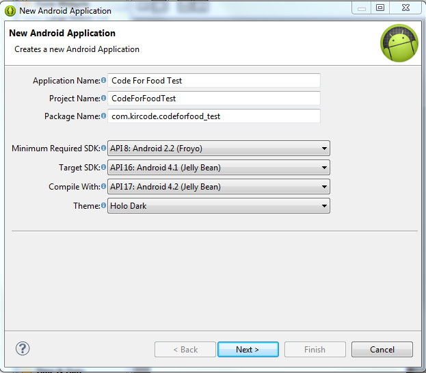
Hit next, and you should be taken to the next configuration step. Here youll see a few check boxes and fields. The first checkbox, "Create custom launcher icon", can be selected if you want to create a custom icon for your application. I do! So I always have this checked.
The next checkbox is "Create activity". Check this, because we want to generate ourselves an Activity. I will explain what an Activity is in details a bit later.
This isnt going to be a library, so dont check "Mark this project as a library". If you have "Create Project in Workspace" checked, the application project folder will be created in the workspace that you defined when you first launched Eclipse. If its unchecked, youll be able to set a custom location for your project. I think its nice to keep things organized and all development projects should be in the development workspace, so I leave this checked.
The next part consists of a checkbox and a selection menu. Its labeled as "Working sets" and the checkbox asks us if we want to add our project to a working set. Working sets are basically groups of projects that are displayed together in the menu when youre working on one of those projects. This is a useful feature and might come in handy when working on multiple applications of the same sort, or of the same purpose, or grouped together for some other reason. Right now we dont want to include our projects in any working sets.
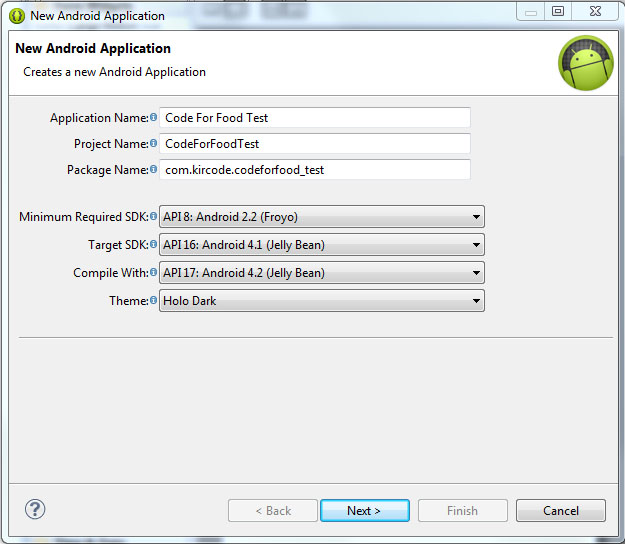
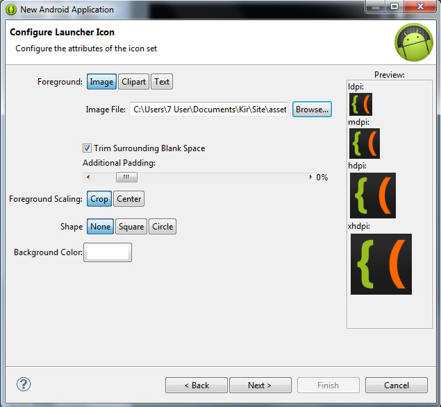
Hit next. We can now set a Launcher Icon for our application. If you have an image ready for that, you can import it here. You can create a new icon using any of the preset clipart images or enter some text to act as an icon. You have several other tools in this window to style your icon.
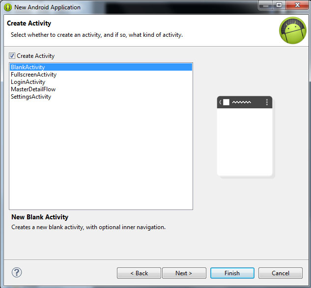
Click next, and now were asked to choose what kind of activity we want to create. Now, simply put, an Activity is a window in Android. You probably know that there arent really any windows in Android at all, except for some dialog boxes, and thats true. But the way Activities behave are similar to windows in computer operating systems. For example, if we launch a game on Android, we are first taken to the main menu screen. This is an Activity. If we click "play", the game itself launches where we can actually play it. This is another Activity. It should be noted that if we didnt purposefully close the previous (main menu) activity when launching the game, it doesnt close. The main menu is still there, under the game, not visible to the user, just "sleeping" and waiting to be opened again.
The Activities have a complex life cycle, which I will explain in later tutorials. For now, you just need to understand that an Activity is a single screen that contains some content, it can be opened, paused, stopped, etc.
So right now were on the Create Activity screen, with 5 available activity types - BlankActivity, FullscreenActivity, LoginActivity, MasterDetailFlow and SettingsActivity. Think of these as of templates.
The BlankActivity is a blank page that we can fill with content.
The FullscreenActivity is a blank page also, but it hides all the UI elements of the device. This is probably most suited for games and video applications.
The LoginActivity is a simple template used for registering or logging in using email and password.
The MasterDetailFlow is a template that has a menu and a content area. It should be noted that the template is displayed differently on tablets and phones (it creates 2 columns on bigger screens where possible, and 1 column on smaller screens).
The SettingsActivity is a simple page with UI components lined up like in the settings screen of your device.
Pick BlankActivity and click Next.
Here we are asked to set the Activity Name, Layout Name and Navigation Type for our main Activity. Leave their values as they are by default - MainActivity, activity_main and None. The names are basically for the developer to remember which Activity is which. The Navigation Type dropdown box lets you select a default navigation method for your Activity. There are multiple nice and useful pre-set navigation features here, but well leave this field None for our first project.
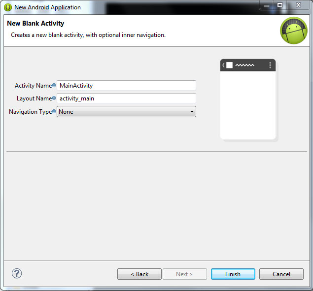
Click Finish, wait, and youre done!
Well continue next time!
Thanks for reading!
Read more »
Launch the Eclipse IDE with Android SDK built in. It will ask you to perform some one-time tasks, such as create a workspace on your hard drive.
When thats done, we can start creating our first application. To begin creating a new Android project, select File > New > Android Application Project.
A dialog box pops up, which requires us to fill out some of the general settings for our future application. The first field is called "Application Name". This is the title of your application - it appears as the name of your app in the Play Store, Manage Applications screen, etc.
The second field is called Project Name. Unlike Application Name, this isnt shown to anyone but the developer when using Eclipse. Usually, the Application Name and Project Name are the same.
The third field is called Package Name. This is basically the id of your application - usually its not shown to the user, but it is required to stay the same for all of the versions of your application. This is similar to ids in Adobe AIR descriptor files. The format is the same as packages in AS3, for example - com.kircode.codeforfood_test
Then we are required to select Minimum Required SDK. This is basically the Android version that is required to run your application. Keep in mind that the lower the version is, the bigger your audience is, but your application wont be able to use some of the newer SDK features. It is recommended to set this value to API 8, this way, according to Android development center, youre targeting 95% of the users. Thats good enough.
The next field is Target SDK. Set this to the highest API version that your application will run on. This value informs the system that the application has been tested on this API and is supposed to work without the sytem having to do any compatibility processes. If youre unsure what to select here, pick one of the modern versions - this way your application wont look dated and will still be compatible with older versions (up to Minimum Required SDK).
The next field is Compile With. This is the API version that the application will be compiled with. If the default value isnt the most recent version, its recommended to pick that.
And finally theres Theme. Pick the color theme that will suit your application. You will, of course, be able to customize every element of your application manually if you want, but choosing a Theme here is a good alternative too.
Hit next, and you should be taken to the next configuration step. Here youll see a few check boxes and fields. The first checkbox, "Create custom launcher icon", can be selected if you want to create a custom icon for your application. I do! So I always have this checked.
The next checkbox is "Create activity". Check this, because we want to generate ourselves an Activity. I will explain what an Activity is in details a bit later.
This isnt going to be a library, so dont check "Mark this project as a library". If you have "Create Project in Workspace" checked, the application project folder will be created in the workspace that you defined when you first launched Eclipse. If its unchecked, youll be able to set a custom location for your project. I think its nice to keep things organized and all development projects should be in the development workspace, so I leave this checked.
The next part consists of a checkbox and a selection menu. Its labeled as "Working sets" and the checkbox asks us if we want to add our project to a working set. Working sets are basically groups of projects that are displayed together in the menu when youre working on one of those projects. This is a useful feature and might come in handy when working on multiple applications of the same sort, or of the same purpose, or grouped together for some other reason. Right now we dont want to include our projects in any working sets.
Hit next. We can now set a Launcher Icon for our application. If you have an image ready for that, you can import it here. You can create a new icon using any of the preset clipart images or enter some text to act as an icon. You have several other tools in this window to style your icon.
Click next, and now were asked to choose what kind of activity we want to create. Now, simply put, an Activity is a window in Android. You probably know that there arent really any windows in Android at all, except for some dialog boxes, and thats true. But the way Activities behave are similar to windows in computer operating systems. For example, if we launch a game on Android, we are first taken to the main menu screen. This is an Activity. If we click "play", the game itself launches where we can actually play it. This is another Activity. It should be noted that if we didnt purposefully close the previous (main menu) activity when launching the game, it doesnt close. The main menu is still there, under the game, not visible to the user, just "sleeping" and waiting to be opened again.
The Activities have a complex life cycle, which I will explain in later tutorials. For now, you just need to understand that an Activity is a single screen that contains some content, it can be opened, paused, stopped, etc.
So right now were on the Create Activity screen, with 5 available activity types - BlankActivity, FullscreenActivity, LoginActivity, MasterDetailFlow and SettingsActivity. Think of these as of templates.
The BlankActivity is a blank page that we can fill with content.
The FullscreenActivity is a blank page also, but it hides all the UI elements of the device. This is probably most suited for games and video applications.
The LoginActivity is a simple template used for registering or logging in using email and password.
The MasterDetailFlow is a template that has a menu and a content area. It should be noted that the template is displayed differently on tablets and phones (it creates 2 columns on bigger screens where possible, and 1 column on smaller screens).
The SettingsActivity is a simple page with UI components lined up like in the settings screen of your device.
Pick BlankActivity and click Next.
Here we are asked to set the Activity Name, Layout Name and Navigation Type for our main Activity. Leave their values as they are by default - MainActivity, activity_main and None. The names are basically for the developer to remember which Activity is which. The Navigation Type dropdown box lets you select a default navigation method for your Activity. There are multiple nice and useful pre-set navigation features here, but well leave this field None for our first project.
Click Finish, wait, and youre done!
Well continue next time!
Thanks for reading!
Wednesday, February 4, 2015
Hard Reset Samsung Galaxy Tab 2 P5100
Hard Reset Samsung Galaxy Tab 2 P5100

Hard reset Tablets when you are not able to access Android Menu on your android tablet.
To follow the procedure you need to these simple steps.
- Turn off the Power by pressing Power button
- Press and hold the Volume up (+) button , Press power button .
- Keep holding both buttons until Android Logo appear
- Release all the button and blue recovery screen will be appeared
- Use volume + (UP)and volume -(down) buttons to select the "Wipe data /Factory Reset".
- Confirm Using Power button (Power button = Enter )
- Select "Yes -- delete all user data "
- Allow some time for factory data reset.
- When done select "Reboot system now" and confirm using power button.
- It will take some time to complete reboot process .
Tuesday, February 3, 2015
WonderMedia WM8880 4 2 1 Tablet Pc Firmware
WonderMedia WM8880 4.2.1 Tablet Pc Factory Firmware
 |
| WM8880 Tablet PC |
Knowledge base :
What board ID , Tablet CPU Chip ,Firmware Number does my Tablet have ?
Frequently Asked Question about Android Tablets
When I need to Restore / flash my Android Tablet Pc ?
1. Forgotten Pattern Lock .
2.Too many pattern attempts / Reset user lock.
3. Tablets PC stuck on Gmail account.
4. Android Tablets PC stuck on Android logo.
5. Tablet Android hang on start up / Multiple errors generating by OS.
6. Android Market having problems or generating errors.
7.Upgrading to new Android OS.
6. Android Market having problems or generating errors.
7.Upgrading to new Android OS.
Instructions:
you can use this Android Tablet firmware, Stock ROM to restore your Android tablets to generic firmwares or upgrades . Make sure to charge battery more than 70% . Power failure during flashing may result dead or broken tablets..
Note : Flashing generic tablet firmware should be last option.
How to Flash WonderMedia WM8880 Android Tablets ?
Download Stock Rom from Below mention link.
Unzip files with winzip or winrar.
You will see FirmwareInstall folder in extracted folder.
CHANGE the + in front of the fwc file in to match your Tablet. (In the config folder) This is very important part. please check your device ID.
Make sure to charge tablet pc to 100%. Power failure during flash may result boken / dead tablets.
Copy FirmwareInstall folder to microsd card. Do not change the name of folder. Copy as it is.
Turn off tablet completely , insert microsd card , Turn WM8880 tablet pc . Upgrading should start and process take some time.
First boot will take upto 2 minutes then work normally .
Enjoy you are done.
V7 WM8880 firmware 2013070
Monday, February 2, 2015
Q88 A13 PBB V4 2 Dual SIV121D SIV121D tablet firmware software
Q88 PBB V4.2 Dual SIV121D SIV121D 3.1
Chip Set : A13
Flashing Tool : Livesuit
Flashing Tutorial : how to flashing tablet with Livesuit
You can also use : Android Multi Tools
The following firmware / ROM file used to be when your tablet facing various problems . In case of Reset User Password , Forgoton Pattern Lock , Tablet stuck on Gmail account , Tablet stuck on Android logo or Tablet hang on start up you can use this Tablet firmware , ROM to make your Android China tablet working again .
Flashing factory firmware should be your last choice.
DOWNLOAD OFFICIAL FIRMWARE
Saturday, January 31, 2015
KirSQLite Flex AIR Database Manager Part 2
In this tutorial well work a little more on the layout - the data grid of the table view screen, specifically.
Firstly, well turn the contents of the first NavigatorContent object into a VGroup, which contains an HBox (something I added just now) and an AdvancedDataGrid that we already have.
The HBox is a container which will contain some tools for editing the data grid. Well add a new column to the datagrid today, which will be a column of CheckBox objects. This way the user will be able to select one or multiple items to perform an action on all of them, for example, delete them all.
For this feature specifically the HBox will contain a CheckBox which will allow the user to select or deselect all of the entries in the table. Set its label to "Select all" and set its change event listener to a function called selectAllChange(), and pass "event" in the parameter. Next to the checkbox, add a button (which does nothing right now) with a label "Delete selected".
In the AdvancedDataGrid itself, well do quite a few changes too. First, set its id to tableGrid. Set its editable property to true.
In the columns array, add a new AdvancedDataGridColumn object with blank headerText and width of 30. Set its sortable, draggable, editable and resizable properties to false. Set this particular columns itemRenderer to an fx:Component container, which contains an mx:Box container, which contains a CheckBox object. Set this CheckBoxs selected property bound to data.sel.
Set the idnum columns editable property to false. Those are all the changes we made to the data grid:
The "sel" property of the "data" object is a boolean variable that is set in the testData array collection. Lets add that to all the items in the array and set the values to false. Lets also increase the number of objects in the array for testing purposes:
Now create fx:Script tags to create a function called selectAllChange(). This function checks if the "Select all" checkbox is selected or not. If it is selected, then loop through all items in testData and set their "sel" properties to true. Otherwise, loop through them and set the values to false.
Whats worth noticing is that all List-like components in Flex (such as List, DataGrid and TileList) dont always create a separate item renderer for each item in the data provider. For example, if we have 500 items in the List, it doesnt mean that the List will have 500 item renderers that all display values for their own assigned items. In these situations, the component usually has a scrollbar (or even two) and not all of the items are visible. For example, only 10 items might be visible out of 500 at a time. The List component just displays 10 and changes their values as the user scrolls through the content.
This boosts up the performance a lot, but can also cause some problems. Like in our situation - if we have a lot of items in the datagrid, say, 100, we obviously wont be able to view all of them at the same time, maybe around 15 at a time - the data grid will only display these 15 visible items.
Whats the problem then? Its that if we use custom modifications, such as CheckBoxes as item renderers of the columns, they also keep their properties like "selected" even if the item renderer is switched to display another item, which might have a different value.
To prevent this, we must bind the select value to data.sel using the {} braces. Because our check boxes are also editable (the user can tick and untick them), we two-way-bind them using @{data.sel}.
Full code so far:
Thanks for reading!
Read more »
Firstly, well turn the contents of the first NavigatorContent object into a VGroup, which contains an HBox (something I added just now) and an AdvancedDataGrid that we already have.
The HBox is a container which will contain some tools for editing the data grid. Well add a new column to the datagrid today, which will be a column of CheckBox objects. This way the user will be able to select one or multiple items to perform an action on all of them, for example, delete them all.
For this feature specifically the HBox will contain a CheckBox which will allow the user to select or deselect all of the entries in the table. Set its label to "Select all" and set its change event listener to a function called selectAllChange(), and pass "event" in the parameter. Next to the checkbox, add a button (which does nothing right now) with a label "Delete selected".
<mx:HBox width="100%" height="30" paddingLeft="8" paddingTop="6">
<mx:CheckBox label="Select all" change="selectAllChange(event);" />
<s:Button label="Delete selected" />
</mx:HBox>
In the AdvancedDataGrid itself, well do quite a few changes too. First, set its id to tableGrid. Set its editable property to true.
In the columns array, add a new AdvancedDataGridColumn object with blank headerText and width of 30. Set its sortable, draggable, editable and resizable properties to false. Set this particular columns itemRenderer to an fx:Component container, which contains an mx:Box container, which contains a CheckBox object. Set this CheckBoxs selected property bound to data.sel.
Set the idnum columns editable property to false. Those are all the changes we made to the data grid:
<mx:AdvancedDataGrid id="tableGrid" width="100%" height="100%" dataProvider="{testData}" editable="true">
<mx:columns>
<mx:AdvancedDataGridColumn headerText=" " width="30" sortable="false" draggable="false" resizable="false" editable="false">
<mx:itemRenderer>
<fx:Component>
<mx:Box width="30" horizontalAlign="center">
<mx:CheckBox selected="@{data.sel}" />
</mx:Box>
</fx:Component>
</mx:itemRenderer>
</mx:AdvancedDataGridColumn>
<mx:AdvancedDataGridColumn dataField="idnum" headerText="ID" editable="false" />
<mx:AdvancedDataGridColumn dataField="firstname" headerText="First name" />
<mx:AdvancedDataGridColumn dataField="lastname" headerText="Last name" />
<mx:AdvancedDataGridColumn dataField="age" headerText="Age"/>
</mx:columns>
</mx:AdvancedDataGrid>
The "sel" property of the "data" object is a boolean variable that is set in the testData array collection. Lets add that to all the items in the array and set the values to false. Lets also increase the number of objects in the array for testing purposes:
<mx:ArrayCollection id="testData">
<fx:Object idnum="1" sel="false" firstname="John" lastname="Jackson" age="32" />
<fx:Object idnum="2" sel="false" firstname="Ted" lastname="Jacobson" age="25" />
<fx:Object idnum="3" sel="false" firstname="Bob" lastname="Smith" age="33" />
<fx:Object idnum="4" sel="false" firstname="John" lastname="Jackson" age="32" />
<fx:Object idnum="5" sel="false" firstname="Ted" lastname="Jacobson" age="25" />
<fx:Object idnum="6" sel="false" firstname="Bob" lastname="Smith" age="33" />
<fx:Object idnum="7" sel="false" firstname="John" lastname="Jackson" age="32" />
<fx:Object idnum="8" sel="false" firstname="Ted" lastname="Jacobson" age="25" />
<fx:Object idnum="9" sel="false" firstname="Bob" lastname="Smith" age="33" />
<fx:Object idnum="10" sel="false" firstname="John" lastname="Jackson" age="32" />
<fx:Object idnum="11" sel="false" firstname="Ted" lastname="Jacobson" age="25" />
<fx:Object idnum="12" sel="false" firstname="Bob" lastname="Smith" age="33" />
<fx:Object idnum="13" sel="false" firstname="John" lastname="Jackson" age="32" />
<fx:Object idnum="14" sel="false" firstname="Ted" lastname="Jacobson" age="25" />
<fx:Object idnum="15" sel="false" firstname="Bob" lastname="Smith" age="33" />
<fx:Object idnum="16" sel="false" firstname="John" lastname="Jackson" age="32" />
<fx:Object idnum="17" sel="false" firstname="Ted" lastname="Jacobson" age="25" />
<fx:Object idnum="18" sel="false" firstname="Bob" lastname="Smith" age="33" />
</mx:ArrayCollection>
Now create fx:Script tags to create a function called selectAllChange(). This function checks if the "Select all" checkbox is selected or not. If it is selected, then loop through all items in testData and set their "sel" properties to true. Otherwise, loop through them and set the values to false.
<fx:Script>
<![CDATA[
import flash.events.Event;
import mx.controls.Alert;

private function selectAllChange(evt:Event):void {
var i:int;
if (evt.currentTarget.selected) {
for (i = 0; i < testData.length; i++) {
testData[i].sel = true;
}
} else
if (!evt.currentTarget.selected) {
for (i = 0; i < testData.length; i++) {
testData[i].sel = false;
}
}
tableGrid.invalidateDisplayList();
tableGrid.invalidateList();
}
]]>
</fx:Script>
Whats worth noticing is that all List-like components in Flex (such as List, DataGrid and TileList) dont always create a separate item renderer for each item in the data provider. For example, if we have 500 items in the List, it doesnt mean that the List will have 500 item renderers that all display values for their own assigned items. In these situations, the component usually has a scrollbar (or even two) and not all of the items are visible. For example, only 10 items might be visible out of 500 at a time. The List component just displays 10 and changes their values as the user scrolls through the content.
This boosts up the performance a lot, but can also cause some problems. Like in our situation - if we have a lot of items in the datagrid, say, 100, we obviously wont be able to view all of them at the same time, maybe around 15 at a time - the data grid will only display these 15 visible items.
Whats the problem then? Its that if we use custom modifications, such as CheckBoxes as item renderers of the columns, they also keep their properties like "selected" even if the item renderer is switched to display another item, which might have a different value.
To prevent this, we must bind the select value to data.sel using the {} braces. Because our check boxes are also editable (the user can tick and untick them), we two-way-bind them using @{data.sel}.
Full code so far:
<?xml version="1.0" encoding="utf-8"?>
<s:WindowedApplication xmlns:fx="http://ns.adobe.com/mxml/2009"
                       xmlns:s="library://ns.adobe.com/flex/spark"
                       xmlns:mx="library://ns.adobe.com/flex/mx" showStatusBar="false">

<s:menu>
<mx:FlexNativeMenu dataProvider="{windowMenu}" showRoot="false" labelField="@label" keyEquivalentField="@key"/>
</s:menu>

<fx:Declarations>
<fx:XML id="windowMenu">
<root>
<menuitem label="Database">
<menuitem label="New" key="n" controlKey="true" />
<menuitem label="Open" key="o" controlKey="true" />
<menuitem label="Save" key="s" controlKey="true" />
<menuitem label="Save As.." key="s" controlKey="true" shiftKey="true" />
</menuitem>
<menuitem label="Table">
<menuitem label="New" key="t" controlKey="true" />
<menuitem label="Edit" key="e" controlKey="true" />
<menuitem label="Delete"/>
</menuitem>
</root>
</fx:XML>
<fx:XMLList id="testTree">
<root>
<treeitem label="Database1">
<treeitem label="Table1"/>
<treeitem label="Table2"/>
<treeitem label="Table3"/>
</treeitem>
</root>
</fx:XMLList>
<mx:ArrayCollection id="testData">
<fx:Object idnum="1" sel="false" firstname="John" lastname="Jackson" age="32" />
<fx:Object idnum="2" sel="false" firstname="Ted" lastname="Jacobson" age="25" />
<fx:Object idnum="3" sel="false" firstname="Bob" lastname="Smith" age="33" />
<fx:Object idnum="4" sel="false" firstname="John" lastname="Jackson" age="32" />
<fx:Object idnum="5" sel="false" firstname="Ted" lastname="Jacobson" age="25" />
<fx:Object idnum="6" sel="false" firstname="Bob" lastname="Smith" age="33" />
<fx:Object idnum="7" sel="false" firstname="John" lastname="Jackson" age="32" />
<fx:Object idnum="8" sel="false" firstname="Ted" lastname="Jacobson" age="25" />
<fx:Object idnum="9" sel="false" firstname="Bob" lastname="Smith" age="33" />
<fx:Object idnum="10" sel="false" firstname="John" lastname="Jackson" age="32" />
<fx:Object idnum="11" sel="false" firstname="Ted" lastname="Jacobson" age="25" />
<fx:Object idnum="12" sel="false" firstname="Bob" lastname="Smith" age="33" />
<fx:Object idnum="13" sel="false" firstname="John" lastname="Jackson" age="32" />
<fx:Object idnum="14" sel="false" firstname="Ted" lastname="Jacobson" age="25" />
<fx:Object idnum="15" sel="false" firstname="Bob" lastname="Smith" age="33" />
<fx:Object idnum="16" sel="false" firstname="John" lastname="Jackson" age="32" />
<fx:Object idnum="17" sel="false" firstname="Ted" lastname="Jacobson" age="25" />
<fx:Object idnum="18" sel="false" firstname="Bob" lastname="Smith" age="33" />
</mx:ArrayCollection>
</fx:Declarations>

<fx:Script>
<![CDATA[
import flash.events.Event;
import mx.controls.Alert;

private function selectAllChange(evt:Event):void {
var i:int;
if (evt.currentTarget.selected) {
for (i = 0; i < testData.length; i++) {
testData[i].sel = true;
}
} else
if (!evt.currentTarget.selected) {
for (i = 0; i < testData.length; i++) {
testData[i].sel = false;
}
}
tableGrid.invalidateDisplayList();
tableGrid.invalidateList();
}
]]>
</fx:Script>

<s:HGroup gap="0" width="100%" height="100%">
<s:VGroup width="200" height="100%" gap="0">
<mx:Tree width="100%" height="100%" dataProvider="{testTree}" showRoot="false" labelField="@label"/>
</s:VGroup>
<s:VGroup width="100%" height="100%" gap="0">
<mx:TabNavigator width="100%" height="100%" paddingTop="0">
<s:NavigatorContent label="Table contents">
<s:VGroup width="100%" height="100%" gap="0">
<mx:HBox width="100%" height="30" paddingLeft="8" paddingTop="6">
<mx:CheckBox label="Select all" change="selectAllChange(event);" />
<s:Button label="Delete selected" />
</mx:HBox>
<mx:AdvancedDataGrid id="tableGrid" width="100%" height="100%" dataProvider="{testData}" editable="true">
<mx:columns>
<mx:AdvancedDataGridColumn headerText=" " width="30" sortable="false" draggable="false" resizable="false" editable="false">
<mx:itemRenderer>
<fx:Component>
<mx:Box width="30" horizontalAlign="center">
<mx:CheckBox selected="@{data.sel}" />
</mx:Box>
</fx:Component>
</mx:itemRenderer>
</mx:AdvancedDataGridColumn>
<mx:AdvancedDataGridColumn dataField="idnum" headerText="ID" editable="false" />
<mx:AdvancedDataGridColumn dataField="firstname" headerText="First name" />
<mx:AdvancedDataGridColumn dataField="lastname" headerText="Last name" />
<mx:AdvancedDataGridColumn dataField="age" headerText="Age"/>
</mx:columns>
</mx:AdvancedDataGrid>
</s:VGroup>
</s:NavigatorContent>
<s:NavigatorContent label="Edit columns">

</s:NavigatorContent>
<s:NavigatorContent label="Query">

</s:NavigatorContent>
</mx:TabNavigator>
</s:VGroup>
</s:HGroup>

</s:WindowedApplication>
Thanks for reading!
Thursday, January 29, 2015
KirSizer Flex AIR Image Sizer app Part 2
In this tutorial we will style our application - give it a nice, smooth look with some transition effects, as well as add a little bit of functionality to the "actions" combo box.
The first thing were going to do, is find every ComboBox and NumericStepper object and set their heights to 22. Set the "Width:" and "Height:" labels widths to 50. Change both mx:TextInputs to s:TextInputs. For the "actionCombo" ComboBox, add a "change" event listener, with a handler function called actionChange().
Then, to each ComboBox object add 4 properties that will be responsible for playing a little animation when the dropdown list opens and closes. The properties are openEasingFunction (set to Linear.easeOut), closeEasingFunction (set to Linear.easeIn), openDuration (set to 300) and close duration (set to 300).
Finally, add hideEffect and showEffect property values to both NavigatorContent objects. Set their values to fadeOut and fadeIn.
Go to the Declarations tags and declare 2 mx:Fade objects called fadeIn and fadeOut. This will be the animation for our viewstack transitions. Set the fadeIns alphaFrom value to 0, alphaTo value to 1, duration to 300; then set fadeOuts alphaFrom to 1, alphaTo to 1, duration to 300.
Create fx:Script tags and do 2 things inside: import the Linear effect class, and create a function called actionChange. The actionChange() function contains a switch case statement, which checks what actionCombos selectedIndex is, and enables or disables width and height components as needed:
Finally, lets add fx:Style tags to create a CSS for some of the components in our application. I customized the styles to get a nice dark theme for the application:
Full code:
Thanks for reading!
Read more »
The first thing were going to do, is find every ComboBox and NumericStepper object and set their heights to 22. Set the "Width:" and "Height:" labels widths to 50. Change both mx:TextInputs to s:TextInputs. For the "actionCombo" ComboBox, add a "change" event listener, with a handler function called actionChange().
Then, to each ComboBox object add 4 properties that will be responsible for playing a little animation when the dropdown list opens and closes. The properties are openEasingFunction (set to Linear.easeOut), closeEasingFunction (set to Linear.easeIn), openDuration (set to 300) and close duration (set to 300).
Finally, add hideEffect and showEffect property values to both NavigatorContent objects. Set their values to fadeOut and fadeIn.
<mx:ViewStack id="contentStack" width="100%" height="100%">
<s:NavigatorContent width="100%" height="100%" hideEffect="fadeOut" showEffect="fadeIn">
<s:VGroup width="100%" height="100%" paddingLeft="10" paddingTop="10" paddingRight="10" paddingBottom="10">
<s:Label>0 files selected</s:Label>
<mx:TileList id="tileList" width="100%" height="100%"/>
<s:Button label="Add folder" width="100%" />
<s:Button label="Add files" width="100%"/>
<s:Button label="Continue" width="100%" click="contentStack.selectedIndex = 1;" />
</s:VGroup>
</s:NavigatorContent>
<s:NavigatorContent width="100%" height="100%" hideEffect="fadeOut" showEffect="fadeIn">
<s:VGroup width="100%" height="100%" paddingLeft="10" paddingTop="10" paddingRight="10" paddingBottom="10">
<s:Button label="Return to file selection" width="100%" click="contentStack.selectedIndex = 0;" />

<s:Label>Resize options:</s:Label>

<mx:ComboBox width="100%" id="actionCombo" height="22" dataProvider="{actions}" selectedIndex="0" editable="false" change="actionChange();"
openEasingFunction="Linear.easeOut" closeEasingFunction="Linear.easeIn" openDuration="300" closeDuration="300"/>
<s:HGroup verticalAlign="middle">
<s:Label width="50">Width:</s:Label>
<s:NumericStepper id="newWidth" height="22" width="150" minimum="1" value="100" maximum="{(widthMeasure.selectedIndex==0)?(100):(4000)}" />
<mx:ComboBox id="widthMeasure" height="22" width="50" dataProvider="{measures}" selectedIndex="0" editable="false"
openEasingFunction="Linear.easeOut" closeEasingFunction="Linear.easeIn" openDuration="300" closeDuration="300"/>
</s:HGroup>

<s:HGroup verticalAlign="middle">
<s:Label width="50">Height:</s:Label>
<s:NumericStepper id="newHeight" height="22" width="150" minimum="1" value="100" maximum="{(heightMeasure.selectedIndex==0)?(100):(4000)}"/>
<mx:ComboBox id="heightMeasure" height="22" width="50" dataProvider="{measures}" selectedIndex="0" editable="false"
openEasingFunction="Linear.easeOut" closeEasingFunction="Linear.easeIn" openDuration="300" closeDuration="300"/>
</s:HGroup>

<s:Label/>

<s:Label>Output file names:</s:Label>
<s:HGroup verticalAlign="middle">
<s:TextInput width="240" text="%initialName%" />
<s:Button width="35" label="?"/>
</s:HGroup>

<s:Label/>

<s:Label>Output destination:</s:Label>
<s:HGroup verticalAlign="middle">
<s:RadioButton id="oldDestination" label="Same directory" groupName="destinationGroup" selected="true" />
<s:RadioButton id="newDestination" label="Specified directory" groupName="destinationGroup" />
</s:HGroup>
<s:HGroup verticalAlign="middle" width="100%">
<s:TextInput width="100%" enabled="{newDestination.selected}" text="Select destination..." editable="false" />
<s:Button width="80" label="Browse" enabled="{newDestination.selected}"/>
</s:HGroup>

<s:Label/>

<s:Label>Output format:</s:Label>
<mx:ComboBox width="100%" height="22" id="formatCombo" dataProvider="{formats}" selectedIndex="0" editable="false"
openEasingFunction="Linear.easeOut" closeEasingFunction="Linear.easeIn" openDuration="300" closeDuration="300"/>

<s:Label/>

<s:Label>Output JPG quality:</s:Label>
<s:HSlider width="100%" minimum="1" maximum="100" value="100" />

<s:Label/>

<s:Button label="Resize" width="100%" />
</s:VGroup>
</s:NavigatorContent>
</mx:ViewStack>
Go to the Declarations tags and declare 2 mx:Fade objects called fadeIn and fadeOut. This will be the animation for our viewstack transitions. Set the fadeIns alphaFrom value to 0, alphaTo value to 1, duration to 300; then set fadeOuts alphaFrom to 1, alphaTo to 1, duration to 300.
<mx:Fade id="fadeIn" alphaFrom="0" alphaTo="1" duration="300"/>
<mx:Fade id="fadeOut" alphaFrom="1" alphaTo="0" duration="300"/>
Create fx:Script tags and do 2 things inside: import the Linear effect class, and create a function called actionChange. The actionChange() function contains a switch case statement, which checks what actionCombos selectedIndex is, and enables or disables width and height components as needed:
<fx:Script>
<![CDATA[
import mx.effects.easing.Linear;

private function actionChange():void{
switch (actionCombo.selectedIndex) {
case 0: case 3:
newWidth.enabled = true;
widthMeasure.enabled = true;
newHeight.enabled = true;
heightMeasure.enabled = true;
break;
case 1:
newWidth.enabled = true;
widthMeasure.enabled = true;
newHeight.enabled = false;
heightMeasure.enabled = false;
break;
case 2:
newWidth.enabled = false;
widthMeasure.enabled = false;
newHeight.enabled = true;
heightMeasure.enabled = true;
break;
}
}
]]>
</fx:Script>
Finally, lets add fx:Style tags to create a CSS for some of the components in our application. I customized the styles to get a nice dark theme for the application:
<fx:Style>
@namespace s "library://ns.adobe.com/flex/spark";
@namespace mx "library://ns.adobe.com/flex/mx";

#contentStack{
backgroundColor: #313131;
}

s|Label{
color: #fcfcfc;
}

s|Button{
chromeColor: #636363;
}

mx|ComboBox{
chromeColor: #636363;
color: #fcfcfc;
contentBackgroundColor: #000000;
rollOverColor: #aaaaaa;
selectionColor: #ffffff;
}
</fx:Style>
Full code:
<?xml version="1.0" encoding="utf-8"?>
<s:WindowedApplication xmlns:fx="http://ns.adobe.com/mxml/2009"
xmlns:s="library://ns.adobe.com/flex/spark"
xmlns:mx="library://ns.adobe.com/flex/mx"
width="300" height="460"
showStatusBar="false" title="KirSizer">

<fx:Declarations>
<mx:ArrayCollection id="measures">
<fx:String>%</fx:String>
<fx:String>px</fx:String>
</mx:ArrayCollection>
<mx:ArrayCollection id="actions">
<fx:String>Fixed width, fixed height</fx:String>
<fx:String>Fixed width, proportional height</fx:String>
<fx:String>Proportional width, fixed height</fx:String>
<fx:String>Proportional sizes to fit specified sizes</fx:String>
</mx:ArrayCollection>
<mx:ArrayCollection id="formats">
<fx:String>Same format as initial file</fx:String>
<fx:String>Convert all to JPG</fx:String>
<fx:String>Convert all to PNG</fx:String>
</mx:ArrayCollection>
<mx:Fade id="fadeIn" alphaFrom="0" alphaTo="1" duration="300"/>
<mx:Fade id="fadeOut" alphaFrom="1" alphaTo="0" duration="300"/>
</fx:Declarations>

<fx:Style>
@namespace s "library://ns.adobe.com/flex/spark";
@namespace mx "library://ns.adobe.com/flex/mx";

#contentStack{
backgroundColor: #313131;
}

s|Label{
color: #fcfcfc;
}

s|Button{
chromeColor: #636363;
}

mx|ComboBox{
chromeColor: #636363;
color: #fcfcfc;
contentBackgroundColor: #000000;
rollOverColor: #aaaaaa;
selectionColor: #ffffff;
}
</fx:Style>

<fx:Script>
<![CDATA[
import mx.effects.easing.Linear;

private function actionChange():void{
switch (actionCombo.selectedIndex) {
case 0: case 3:
newWidth.enabled = true;
widthMeasure.enabled = true;
newHeight.enabled = true;
heightMeasure.enabled = true;
break;
case 1:
newWidth.enabled = true;
widthMeasure.enabled = true;
newHeight.enabled = false;
heightMeasure.enabled = false;
break;
case 2:
newWidth.enabled = false;
widthMeasure.enabled = false;
newHeight.enabled = true;
heightMeasure.enabled = true;
break;
}
}
]]>
</fx:Script>

<mx:ViewStack id="contentStack" width="100%" height="100%">
<s:NavigatorContent width="100%" height="100%" hideEffect="fadeOut" showEffect="fadeIn">
<s:VGroup width="100%" height="100%" paddingLeft="10" paddingTop="10" paddingRight="10" paddingBottom="10">
<s:Label>0 files selected</s:Label>
<mx:TileList id="tileList" width="100%" height="100%"/>
<s:Button label="Add folder" width="100%" />
<s:Button label="Add files" width="100%"/>
<s:Button label="Continue" width="100%" click="contentStack.selectedIndex = 1;" />
</s:VGroup>
</s:NavigatorContent>
<s:NavigatorContent width="100%" height="100%" hideEffect="fadeOut" showEffect="fadeIn">
<s:VGroup width="100%" height="100%" paddingLeft="10" paddingTop="10" paddingRight="10" paddingBottom="10">
<s:Button label="Return to file selection" width="100%" click="contentStack.selectedIndex = 0;" />

<s:Label>Resize options:</s:Label>

<mx:ComboBox width="100%" id="actionCombo" height="22" dataProvider="{actions}" selectedIndex="0" editable="false" change="actionChange();"
openEasingFunction="Linear.easeOut" closeEasingFunction="Linear.easeIn" openDuration="300" closeDuration="300"/>
<s:HGroup verticalAlign="middle">
<s:Label width="50">Width:</s:Label>
<s:NumericStepper id="newWidth" height="22" width="150" minimum="1" value="100" maximum="{(widthMeasure.selectedIndex==0)?(100):(4000)}" />
<mx:ComboBox id="widthMeasure" height="22" width="50" dataProvider="{measures}" selectedIndex="0" editable="false"
openEasingFunction="Linear.easeOut" closeEasingFunction="Linear.easeIn" openDuration="300" closeDuration="300"/>
</s:HGroup>

<s:HGroup verticalAlign="middle">
<s:Label width="50">Height:</s:Label>
<s:NumericStepper id="newHeight" height="22" width="150" minimum="1" value="100" maximum="{(heightMeasure.selectedIndex==0)?(100):(4000)}"/>
<mx:ComboBox id="heightMeasure" height="22" width="50" dataProvider="{measures}" selectedIndex="0" editable="false"
openEasingFunction="Linear.easeOut" closeEasingFunction="Linear.easeIn" openDuration="300" closeDuration="300"/>
</s:HGroup>

<s:Label/>

<s:Label>Output file names:</s:Label>
<s:HGroup verticalAlign="middle">
<s:TextInput width="240" text="%initialName%" />
<s:Button width="35" label="?"/>
</s:HGroup>

<s:Label/>

<s:Label>Output destination:</s:Label>
<s:HGroup verticalAlign="middle">
<s:RadioButton id="oldDestination" label="Same directory" groupName="destinationGroup" selected="true" />
<s:RadioButton id="newDestination" label="Specified directory" groupName="destinationGroup" />
</s:HGroup>
<s:HGroup verticalAlign="middle" width="100%">
<s:TextInput width="100%" enabled="{newDestination.selected}" text="Select destination..." editable="false" />
<s:Button width="80" label="Browse" enabled="{newDestination.selected}"/>
</s:HGroup>

<s:Label/>

<s:Label>Output format:</s:Label>
<mx:ComboBox width="100%" height="22" id="formatCombo" dataProvider="{formats}" selectedIndex="0" editable="false"
openEasingFunction="Linear.easeOut" closeEasingFunction="Linear.easeIn" openDuration="300" closeDuration="300"/>

<s:Label/>

<s:Label>Output JPG quality:</s:Label>
<s:HSlider width="100%" minimum="1" maximum="100" value="100" />

<s:Label/>

<s:Button label="Resize" width="100%" />
</s:VGroup>
</s:NavigatorContent>
</mx:ViewStack>
</s:WindowedApplication>
Thanks for reading!
Wednesday, January 28, 2015
2010 Crossfit Games Northern California Qualifier Day 2
Introduction
After a smooth first day of competition, Sunday was a bit of a mess. Although all of Saturdays scores and standings were available online, no one really knew who was eliminated, who would compete on Sunday, when to show up or when the workouts were. Not until ~11PM on Saturday did a link to a heat schedule appear on the Crossfit Games website in the comments of the day 1 results page. The schedule looked legit - there were timings for the top 186 finishers from Saturday (the other 70 were cut) - but the whole thing looked poorly planned out.

My workout wasnt scheduled until noon, but I felt bad for those who had their first heats at 8am. The disorder continued when we arrived around 10:30 and found out that everything was massively delayed and my workout had been pushed back to 1:20. I wouldve expected these sorts of details to have been worked out more smoothly considering registration for the qualifier was $100.
Anyways, after baking in the sun for 3 hours, it was time for the two back-to-back Sunday workouts:
Workout C1
In 6 minutes, work up to a max squat clean to overhead.
* The bar must start on the ground, you must pass through a squat, and then send the bar overhead in any manner you choose.
* Youll be able to designate your opening weight before the workout begins, and the judge will be able to help you load and unload weights. In addition, youll have plenty of time to warm-up prior to the beginning of your heat.
Weight completed: 235lbs (missed 245lbs twice)
Rank: 61 (out of 174 competitors)
Once again, Crossfit honed in on another weakness of mine: the split jerk. I could get the bar to my shoulders without difficulty - the cleans were no where near my max - but I just could not get more than 235lbs over my head. I missed the jerk on 245lbs twice, both times with horrendous technique. Ill definitely be practicing this lift a lot more in the future.
Workout C2
At the immediate conclusion of Workout C1, perform the following for time:
25 Burpees
100-yard Walking Lunge
Then 5 Rounds of:
- 15 Dumbbell Shoulder-to-Overhead (40lbs)
- 100-yard Dumbbell Farmers Walk (40lbs)
Then 25 Burpees
Row 500m
Run 450 yards
Time: 21:25
Rank: 101 (out of 173 competitors)
A brutal workout - especially on the shoulder/traps from the combo of farmers walk and shoulder press - but overall, a pretty classic Crossfit "chipper."
Final Thoughts

I ended the weekend in 61st place out of 256+ competitors. As a software engineer who spends ~10 hours a day behind a desk, Im pretty happy with a finish in the top 25%. To qualify for the regionals, I wouldve needed to finish in the top ~8%, but I had too many holes in my fitness. The good news is that I had one hell of a fun weekend: the athletes put up some amazing performances, the spectators were incredibly supportive, I learned a lot from the experience, and I know what I need to work on for next year.
Pictures and Videos
Day 2 pictures
Day 2 videos
Read more »
After a smooth first day of competition, Sunday was a bit of a mess. Although all of Saturdays scores and standings were available online, no one really knew who was eliminated, who would compete on Sunday, when to show up or when the workouts were. Not until ~11PM on Saturday did a link to a heat schedule appear on the Crossfit Games website in the comments of the day 1 results page. The schedule looked legit - there were timings for the top 186 finishers from Saturday (the other 70 were cut) - but the whole thing looked poorly planned out.
My workout wasnt scheduled until noon, but I felt bad for those who had their first heats at 8am. The disorder continued when we arrived around 10:30 and found out that everything was massively delayed and my workout had been pushed back to 1:20. I wouldve expected these sorts of details to have been worked out more smoothly considering registration for the qualifier was $100.
Anyways, after baking in the sun for 3 hours, it was time for the two back-to-back Sunday workouts:
Workout C1
In 6 minutes, work up to a max squat clean to overhead.
* The bar must start on the ground, you must pass through a squat, and then send the bar overhead in any manner you choose.
* Youll be able to designate your opening weight before the workout begins, and the judge will be able to help you load and unload weights. In addition, youll have plenty of time to warm-up prior to the beginning of your heat.
Weight completed: 235lbs (missed 245lbs twice)
Rank: 61 (out of 174 competitors)
Once again, Crossfit honed in on another weakness of mine: the split jerk. I could get the bar to my shoulders without difficulty - the cleans were no where near my max - but I just could not get more than 235lbs over my head. I missed the jerk on 245lbs twice, both times with horrendous technique. Ill definitely be practicing this lift a lot more in the future.
Workout C2
At the immediate conclusion of Workout C1, perform the following for time:
25 Burpees
100-yard Walking Lunge
Then 5 Rounds of:
- 15 Dumbbell Shoulder-to-Overhead (40lbs)
- 100-yard Dumbbell Farmers Walk (40lbs)
Then 25 Burpees
Row 500m
Run 450 yards
Time: 21:25
Rank: 101 (out of 173 competitors)
A brutal workout - especially on the shoulder/traps from the combo of farmers walk and shoulder press - but overall, a pretty classic Crossfit "chipper."
Final Thoughts
I ended the weekend in 61st place out of 256+ competitors. As a software engineer who spends ~10 hours a day behind a desk, Im pretty happy with a finish in the top 25%. To qualify for the regionals, I wouldve needed to finish in the top ~8%, but I had too many holes in my fitness. The good news is that I had one hell of a fun weekend: the athletes put up some amazing performances, the spectators were incredibly supportive, I learned a lot from the experience, and I know what I need to work on for next year.
Pictures and Videos
Day 2 pictures
Day 2 videos
Wednesday, January 21, 2015
ONYO Winner XL 9 2 Android Tablet Firmware
ONYO Winner XL 9.2 Official Updates.

ONYO Winner XL 9.2 Official Updates.
DOWNLOAD OFFICIAL FIRMWARE
Subscribe to:
Posts (Atom)